Beginner’s (and others) guide to choosing colors

Having the right colors is crucial to be able to mix with them. Most watercolor sets have a decent range of colors, but they often lack some important color, and it also often includes several unnecessary ones.
I will present the 11 colors that I expect all my students to have and which are a good starting point for all types of color mixes. Note that this is not a “personal” palette, it is a palette to mix with, all colors are selected according to their hue and mixing properties.
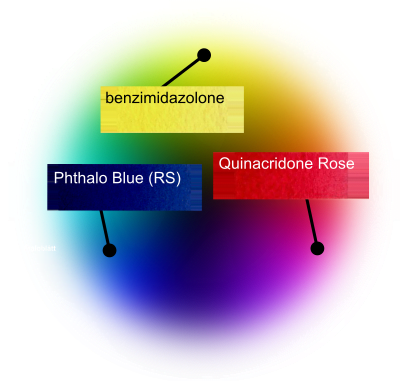
We start with the three primary colors, these are a must have. They are important because you can mix them to any other color. It is also very important to choose the right one here, for example it does not work with any blue, it should be the blue color that is closest to the primary blue and has a pure hue.
Yellow
Must be a lemon yellow color, a cold yellow color. I think the best is PY175 (benzimidazolone) which has different names from different manufacturers, (See the list at the end of the article.)
Red
There is only one: Quinacridone Rose, the index name is PV19 (RS) manufacturers often call it Quinacridone Rose or Premanent rose.
Blue
The same as for red color also applies to blue, there are no alternatives to Phthalo blue red shade. It is the perfect primary blue color, no other is as good primary blue.

Thus, the three primary colors are completed, now: some other colors.
Green
Phthalo Green Yellow Shade is the perfect complementary color to the primary red Quinacridone Rose, therefore you should have it, it is very good to have a complementary color to red and Phthalo Green (YS) is perfect. If you, like most people, have a Phthalo green blue shade, it will do, mixtures with the red will be a little violet, so it is better with the yellow shade, but blue shade will do, when the pan or tube is empty you buy yellow shade.
Warm yellow and warm red
Since the eye is sensitive in the yellow-red register, it can be good to also have a warm yellow and red at your disposal. Namely, it is difficult to make nice color mixtures in this area with only a cold yellow and a cold red. Any warm yellow and red will do, my favorites are Nickel Azo Yellow (PY150) from Daniel Smith and Transparent Pyrrol Orange also from Daniel Smith.
More blue colors
Just because blue is so important to me, I want to include some blue options. Phthalo blue is perfect as a primary color, but it is at the same time dull and flat. French ultramarine is a much nicer watercolor. It is too red to be a primary color, but it expands the palette with several new mixing options, so it is important. I think you should also have cobalt blue, a slightly milky light color with great potential for interesting mixtures.
Brown colors
There are lots of good brown colors but only two that one must have: burnt sienna and raw sienna, They are light brown colors, it is good because it is easy to make a light color dark, but the reverse is impossible. So if you are only going to have two browns, it should be these. In watercolor sets, the yellow-brown color is usually ocher, not sienna. If you have such a box, you should of course use the opaque yellow ocher until it runs out but then buy a transparent raw sienna.
Black color
Black color is important, without it, it is not possible to lower the value of other colors without changing their hue. The black should be neutral, Only two colors are common and work as black in the watercolor box: Ivory black and lamp black. Ivory black is transparent and easy to mix with other colors, while lamp black is more opaque and not as good, so the choice is simple, it will be ivory black.

If you understand the color wheel and own these 11 colors, you have the opportunity to mix all the colors you need. As I mentioned earlier, this is not a “personal” palette, you will probably grow out of it over time, but it is a good basis for color mixes, it is very versatile .
What different manufacturers call the different colors:
PY175 (benzimidazolone)
Winsor & Newton | Cotman: Lemon yellow PY175
Winsor & Newton: Winsor Lemon PY175
Schmincke: Chromium yellow hue lemon PY175
Holbein: Imadazoline lemon PY175
Daniel Smith: Lemon yellow PY175
Maimeri Blu: Permanent Yellow Lemon PY175
PV19 Quinacridone Rose
Winsor & Newton: permanent rose
Maimeri Blu: rose lake
Old Holland: royal purple laka
DaVinci: permanent rose (quinacridone)
All other: Quinacridone Rose
PB15:1 (or 15:6) Phthalo blue red shade
Winsor & Newton: winsor blue (RS)
Maimeri Blu: berlin blue
Schmincke: helio blue RS
M. Graham: phthalocyanine blue red shade
Blockx: blockx blue
All other: phthalo blue or phthalo blue (RS)
PG 36 Phthalo Green Yellow Shade
Maimeri Blu: cupric green light
Rembrandt: bright green
Holbein: bamboo green
Winsor & Newton: Winsor green YS
M. Graham: phthalocyanine green yellow shade
Daniel Smith: phthalo green YS
PY150 nickel azo
Daniel Smith: nickel azo yellow
Winsor & Newton: transparent yellow
Schmincke: transparent yellow
M. Graham: nickel azo yellow
PO71 Transparent Pyrrol Orange
Daniel Smith: Transparent Pyrrol Orange
Schmincke: translucent orange
PB29 French ultramarine
All manufacturers call the color french ultramarine blue or just ultramarine blue some add words like “deep” or “finest” look at the index name which should be PB29.
PB28 cobalt blue
All manufacturers call the color cobalt blue but make sure that it really is PB28, the color is falsified quite often.
Burnt sienna (different pigments)
All manufacturers have the color and everyone calls it burnt sienna.
Raw sienna (different pigments)
All manufacturers have raw sienna and all have named the raw sienna. Some manufacturers mix their color with two or more pigments, avoid these.
PBk9 ivory black
Called by all manufacturers ivory black


Excellent information, brief and concise. Very helpful
What does YS or RS mean?
Some pigments are available in different shades:
YS = Yellow shade
RS = Red shade
BS = Blue shade
GS = Green shade
I have a different set of choices. I start with the CMYK palette and expand from there. This is because of subtractive mixing. I also favor mostly inorganic pigments for their greater lightfastness (typically). Every palette has pros and cons. A lot of watercolorists dislike opaque pigments like PY 184 and fussy pigments like PV 14.
bismuth lemon (any legitimate brand)
vermilion hue (Old Holland PR 251)
viridian (any legitimate brand)
manganese cyan ‘blue’. (genuine, handmade Etsy seller)
cobalt turquoise PG 50 (to use instead of manganese when possible)
ultramarine finest (Schmincke, low granulation)
cobalt red-violet (handmade Etsy seller, PV 14 bright form)
bone black ‘ivory’ (any brand, really), or iron black… depending upon the painting
muck — leftover palette paint mixed together
I take precautions because of the barium manganate in the cyan and cobalt phosphate in the violet, both of which are soluble. The cobalt in PG50 is very insoluble so it’s not a toxicity concern. PV 14 also shouldn’t be allowed to cook in a very hot window exposure or it will break down chemically, causing it to fade.
I see no use for purchased dull pigments like browns, although I do use ‘muck’
More rarely, I use a much more conventional palette of transparent/translucent non-granulating (most of them) mostly organic pigments:
Phthalo green YS
PY 175 or PY 184 if opacity isn’t an issue (more lightfast)
PY 110
PO 73 (pyrolle orange)
PR 168 anthra scarlet or PR 251
PR 122 quin magenta
cobalt red-violet (more durable than quins unless exposed to heat)
ultramarine finest
phthalo blue GS
muck
bone black
I also have a more muted palette of more obscure pigments that’s fun to use:
pinkcolor PR 233
cobalt green pale PG 19 or chromium oxide green
praesodymium-zirconium lemon (Kremer)
zirconium violet (Schmincke)
cobalt-lithium violet light PV 47 (Holbein)
cobalt blue deep
zirconium cyan (Kremer)
yellow ocher (iron yellow, limonite) or PBr 24 (actually dull yellow not brown)
cerium red (Kremer)
RTZ ‘Hokkaido orange’
muck
This particular palette has rock-solid lightfastness.
Could you please share your opinion on using Daniel Smith colors in stick as oppose to tubes? I need to decide which kind to order, the sticks are more economical and in my opinion more practical but your opinion has great value for a beginner like me. thank you.
I have never tried DS sticks. But as for how economical they are, I’m doubtful. A stick contains 12 ml while tubes have 15. The price for sticks is only slightly cheaper than for tubes.
But for me, it is the creamy texture of the tube color that decides in its favor. Easy to mix large amounts of paint and easy to make dark color mixes.
According to Daniel Smith, one stick corresponds to 3 whole pans, while you can easily fill 4 of the same size with a tube. But if you paint small and carefully, they are certainly good and easy to take with you, you can draw with them, create fun effects, etc. I’m a bit curious about them myself, but I’d never replace my tubes with sticks.