
Use the color wheel as a guide for mixtures
December 13, 2020
Many people understand the color wheel as a theoretical construction that explains how the different colors are connected in a system. But few use it as a template for mixes. I intend to explain here how the color wheel is useful for color mixing,
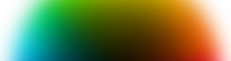
In the outer ring around the circle, all colors are represented. Yellow at the top of the circle (other circles may use a different color at the top) and violet at the bottom. There is no boundary between the different colors but they flow into each other. In the center is black. A color that is placed a bit towards the center is thus blackish, unclear, if it is a yellow or orange color, there is a name for it: brown. In the periphery of the circle there are thus pure colors. inside the outer ring are all colors that are unclear (blackish) represented. The further towards the center a color is, the more blackish, unclear it is. Other color shades, those that are whitish unclear usually appear outside the circle.
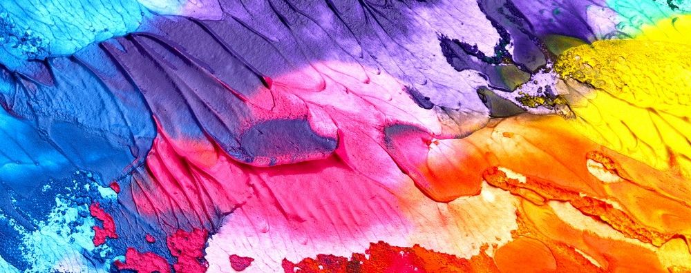
An example of how different colors give different results when mixed to the same color
We will mix a yellow-green color. For this we first use a yellow and a green, both colors are as pure as possible. This mixture is shown as example a in the illustration below. The second mixture is made of a blue and the same yellow. This is shown as example b. Both mixtures achieve the same color tone but example a is much cleaner than example b. The reason is simple: With yellow and blue, the mixed color ends up closer to the center of the circle, because the colors are further apart, and thus more blackish, which we perceive as an unclear color.


How to make a pure color unclear
Say that blue color is not included in our chosen palette, but we still want to get the color in mixture b. It is possible to imitate the color as example b shows by lowering its value. This can be done in two different ways, using a neutral black or with the complementary color to the mixture. Black is only used exceptionally, so we will use the complementary color. This means that you should mix in a cool red color (red is on the opposite side of the color wheel to green).


Mixture 2 is Lemon Yellow (PY175) and Phthalo Blue (RS)
Mixture 3 is made with Lemon Yellow (PY175) and phthalo green (YS) and lowered in value with Quinacridone Rose
With the three selected colors it is possible to mix all colors within the triangle shown in the illustration above. Whatever colors you choose for a particular painting, it is important to be able to mix a black and gray color, therefore you should always make sure that the colors are placed in such a way in the circle that black is possible to mix. Sometimes it is possible to achieve with three colors, sometimes four are needed, exceptionally it is possible with only two colors.
So choose two colors that are close to each other if you want pure color mixtures, when you need to make a color more unclear add the complementary color (cold red-green, orange-blue, yellow-violet)
My favorite palette
One color combination that I keep coming back to is French Ultramarine, burnt sienna and raw sienna. Together they give a dull color scale that I find very attractive. It is possible to mix to good black with burnt sienna and ultramarine, with some sienna the mixture becomes a little violet, then you have to mix in a little raw sienna, Green colors with raw sienna and ultramarine become very unclear but they at least give a hint of green. To maintain a consistent palette, I ignore green with these colors,

If there is a green color in the picture, I paint it with raw sienna and ultramarine regardless of whether the mixture just gets a little greenish, as I see it, it is more important that the colors harmonize with each other than that it is the same as in reality.