Green Gold – PY129
April 14, 2022

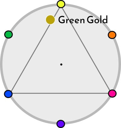
The name green gold probably comes from the metal made of an alloy of gold and Palladium (or silver). As a watercolor paint, it was the pigment PG10 that was first named green gold. However, the production of PG10 ceased more than 20 years ago.
When a name for an artist’s paint is established, it must be maintained, so the paint manufacturers found a similar pigment, namely PY129, which would replace PG10 with the same name.
Green gold, PY129 is a semi-transparent yellow-green, fully Lightfast, fairly unclear color. The paint is staining and it does not granulate at all. Like so many watercolor paints, it loses some hue and value when it dries. Green Gold is a bit reluctant in water, it does not float so well with the water, but only moves a little on a wet surface.
Hanslinger~ruwiki, CC BY-SA 4.0
via Wikimedia Commons
Depending on how much the color is diluted with water, the hue varies from unclear greenish yellow to light bright yellow. It is a nickel azo pigment, invented in 1972 and related to PG10 and PY150. As I have mentioned before, yellow-green pigments are quite unusual, there is an abundance of different mixed colors that are yellow-green. But pigments that have that color tone are not as common.
Green gold provides fantastic blending possibilities with any magenta color, bright orange-brown can be achieved. The complement color is blue-violet but it is difficult to find a pigment that gives a gray color mixture. Many artists appreciate the nice orange color blends that can be achieved with Quinacridone Rose or alizarin.
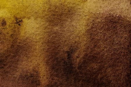

When you paint with a mixture of some quinacridone pigment of magenta hue and PY129, intricate patterns arise if you use a lot of liquid, so that the colors have plenty of time to move in the water.
The color also gives nice deep greens together with intense blue colors such as phthalo. I find the light green mixtures a bit shabby while the deep green ones are very nice.

While some artists believe that the color is a must in every watercolor painter’s palette, it is a color I have never taken any interest in. I thought the slightly greener old green gold (PG10) was an interesting color, but I have never been fascinated by the new yellower green gold, PY129.
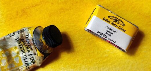
I do not find the yellow intense but still dirty appearance so attractive. Now that I have bought a tube for this text, maybe I should also try it in some paintings. Maybe then I will change my mind. If you have experience with the color, feel free to write your thoughts about it in the comment field below.

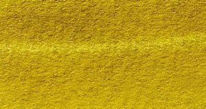


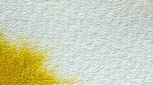
Manufacturers using PY129
WINSOR & NEWTON: GREEN GOLD PY129
DANIEL SMITH: RICH GREEN GOLD PY129
MAIMERIBLU: GREEN GOLD PY129
GOLDEN : QOR: GREEN GOLD PY129
DALER ROWNEY: GREEN GOLD PY129
OLD HOLLAND: GOLDEN GREEN PY129
DA VINCI: Green Gold PY129
M. GRAHAM: Azo Green PY129
KREMER: Yellow, greenish PY129
Mixed colors or other pigments
MIJELLO: GREEN GOLD PY150
DANIEL SMITH: GREEN GOLD PG36, PY150, PY3
ROMAN SZMAL: GREEN GOLD PY150, PY129, PG36
SCHMINCKE: TRANSPARENT GREEN GOLD PY154, PBr7
OLD HOLLAND: GOLDEN GREEN DEEP PG36, PY129
BLOCKX: GOLDEN GREEN PY154, PG36
Information
Color index name: PY129
Lightfastness : Excellent
Transparency: Semi-transparent
Staining: Yes
Granules: No.




Interesting review, thank you. I use Daniel Smith “Green Gold” (PY150 PY3 PG36) and find it a useful and clean colour. This is not the same as the single pigment “Rich Green Gold”.
“Green Gold” glows, almost fluorescent, which I find useful for young leaves, or reflections of lights on pavements. It’s a mixed pigment colour, but I still find it pure and clean. In mixes with umber brown it becomes dull, which is also useful sometimes. I’d be interested in your thoughts. Thanks for a great and useful website. I came here to read your review of Nickel Azo Yellow – and ended up browsing…..
Have never tried Green Gold from DS, I have a severe allergy to mixed colors.
We all come for one thing and up browsing the whole site 😄
Thank you for this useful article. I love PY129, although I’ve never used it. I tried Schmincke’s Transparent Green Gold, which is nice, but I much prefer my dupe: PY150 with the tiniest hint of PBk31. PBk31, being a greenish-black pigment, makes PY150 lean towards green and become more earthy. It really does mimic PY129. I also plan to use other mixes to see what other paints can create a PY129 hue.