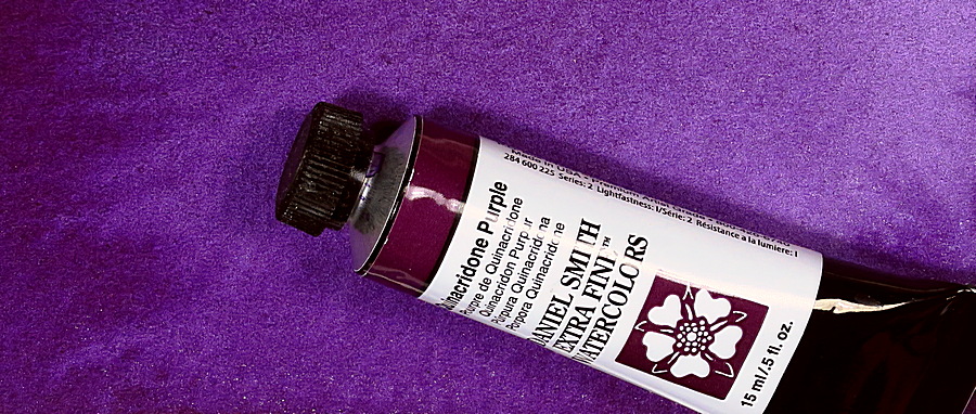
Quinacridone Purple PV55

The color commonly referred to as Quinacridone Purple is a relatively new watercolor paint. The first one on the market was introduced by Daniel Smith in 2011. Following the initial introduction of this color, other manufacturers followed suit, and now there are several producers of the watercolor.
Quinacridone Purple is an intense, slightly reddish purple hue that is durable. The color is somewhat unclear, semi-transparent, and can be a bit reluctant to flow on wet surfaces. It has a slight blackish undertone. It’s a valuable addition to the extensive family of Quinacridone pigments, which primarily consist of various red and violet shades.
The availability of Quinacridone Purple is not very extensive. These are the major manufacturers I’ve found:
Schmincke: Quinacridone Purple PV55
Roman Szmal: Quinacridone Purple PV55
Daniel Smith: Quinacridone Purple PV55
Royal Talens, Rembrandt: Quinacridone Purple Bluish PV55
Royal Talens, Van Gogh: Quinacridone Purple Red PV55
Winsor & Newton Quinacridone Violet PV55
White Nights: Quinacridone Violet PV55
It’s a color that may not be best used on its own, but it works exceptionally well when combined with other colors. You can create intriguing shades through mixtures with both orange and green colors.


Mixed with Isoindoline Yellow.
Among colors with a similar hue and properties, Carbazole violet is the closest. This color is slightly purer and bluer than Quinacridone Purple but shares similar characteristics. If I were forced to choose between the two, my preference would be Carbazole violet due to its purity and being a perfect secondary violet, i.e., a complement to primary yellow.
There aren’t many options when it comes to blue-violet colors, so any addition is welcome. Quinacridone Purple is an easy-to-use color with a slight blackish undertone. Despite its lack of clarity, it blends well and should be an asset to most watercolor palettes.
I often say in my watercolor classes, during the early discussions of various colors, that violet colors are unnecessary because they are so easy to mix with red and blue. Nevertheless, they can be valuable, expanding your possibilities for interesting mixtures.
Blue-violet colors are rare, especially if you don’t want a granulating color. Aside from a few uncommon pigments, there are really only Carbazole violet and Quinacridone Purple when it comes to purples. The choice between them is a matter of personal preference. You might choose to skip purple since it’s easy to mix such a color yourself.
Information
Pigment: PV55
Lightfastness: excellent
Transparency: Semi-transparent
Staining: slightly
Granulates: Not at all


Not much difference


