
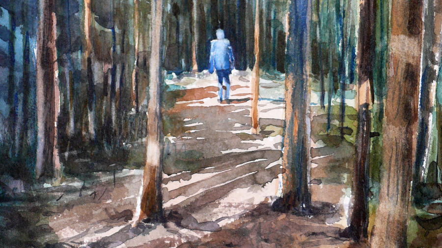
Alone in the woods (an exercise)
October 7, 2020
It is important to let go. Not to be so careful. In this painting, you paint layer upon layer, or more correctly: Spots on top of other color spots. Avoid being too careful it will ruin this painting, you should be relaxed and let the brush run over the paper.

Use three primary colors for this painting. A blue, yellow, and red. I do not mean exact primary colors, just that they should be about that color. I used phthalo blue. Nickel dioxin yellow and Brown madder (Brown madder is a dirty dark pink color that I usually do not like, it is so aggressive. But here it works fine I think). You may not have these three colors, use something else in that case, the colors should be roughly primary colors.
Step 1

The darkest parts of the photo are at the side of the path, on the left and a little on the right. In front of the man it is quite bright. I want to give a different feeling in the picture, I want the darkest in front of the figure, as if he is wandering into the unknown.
Start with the yellow-green in the upper part of the image and change a bit down to dark green colors and also pure blue, Save the tree trunks and the figure. All this is painted quickly and at random, do not worry if the color blooms or flows away in an uncontrolled way, it is the charm of watercolor, how the colors behave when you do not force them to obedience. Paint a path with bright red-brown-yellow colors (you have to mix). Already in this step, try to establish the values in the painting, where it is light and dark, respectively. It is important.
This whole first step should be painted quickly, you should have it completed in a few minutes. If it takes too long, it probably means you have been too careful. Notice the crooked tree trunks on my painting, It is not intentional, the brush happened to move that way over the paper, and then you let it be that way, do not try to repair this, it’s fine.
Step 2

Paint the tree trunks, Not with one and the same color, but different value and color hue depending on how shadows and light are falling over them. Some distant trees may be brighter than the surroundings, they are saved by painting darker all around. Paint narrow tree trunks in the background and thicker in the front. Some of the trunks may be broken up, paint a small piece, make a break, then continue to paint the tree trunk. In this way you give the impression that there is vegetation in front of the tree.
You should also start painting some green. Do this with the help of spots, it is important that the spots have a direction. I tried to paint them in a downward direction pointing to the figure in the middle. Do not paint anything in the middle at the top of the painting. That surface should be “sky” and light.
Step 3

Keep adding green to the background until you are satisfied. Even dark smaller trees in the distance. Then the path should be painted, You can make a light horizontal pattern that indicates that the ground is uneven. You should also make the important shadows. The light comes from behind so the shadows have a forward direction to the right in the image. Feel free to make strong shadows in the foreground and lighter at a distance.
Keep in mind that the inclination of the shadows is not the same at the front and further back in the image. They seem to tilt less gradually, they become more horizontal in the background. It is the perspective that creates this effect, it is really an illusion, all shadows have the same angle. But on a flat surface, the perspective makes them appear to be more horizontal further back in the painting.