
Blue favorites
October 27, 2024

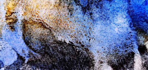
There are many nice blue watercolors, and I like most of them. I use blue color for a lot, and blue is an essential component in most of the color mixes I create. Additionally, blue colors vary widely, both in appearance and in their uses, so several different blue watercolor colors are needed.
French Ultramarine

First and foremost, I must mention French Ultramarine, which is my absolute favorite. For me, it’s the classic French Ultramarine that stands out. There are various types that usually come with additional names like “green tone,” “light,” “dark,” or simply “Ultramarine” without the “French” part. Most of these use the same pigment as the French Ultramarine, so it can be tricky to find the right one.
The original French Ultramarine is a reddish warm blue, heavily granulating, and fairly intense. It’s the perfect color for gray-toned mixes when combined with a brown-orange color. It may not be ideal for greenish mixes with yellow, but it creates wonderful purples when mixed with a cool red.
For me, the granulation is a huge plus, though I know there are those who don’t appreciate it. Granulation is so important to me that I choose Winsor & Newton over other brands, as it granulates a bit more than others’ ultramarine.
Cobalt Blue

In my opinion, the most beautiful blue is Cobalt Blue. However, it has several drawbacks, which is why it doesn’t top my list. It leans slightly toward the red on the color wheel and, like French Ultramarine, it granulates. However, its milky, whitish quality and light tone limit its range of use.
One has to be cautious when buying Cobalt Blue, as many manufacturers falsifies it because the pigment is expensive. Make sure the pigment is indeed PB28 before purchasing.
Phthalo Blue Red Shade

There are many synthetic, clear, and intense blues, such as Prussian Blue, Phthalo Blue, and Indanthrone. They all dry to a flat, muted appearance, losing much color and depth when dry. Of these somewhat boring colors, I use Phthalo Blue Red Shade the most. The reason is simple: it’s the best primary blue, clear and pure in tone, and exactly right on the color wheel. However, at the same time, Phthalo Blue is somewhat boring and bland. It’s a color I often use, not because I love it, but because it’s the best choice among what’s available.
Manganese Blue

Aside from the more intense blue shades, there are some pale blues with a different application; I like to combine these with a more vibrant blue. My absolute favorite is Manganese Blue, which is unfortunately no longer produced. Cerulean Blue is probably the closest substitute, with a turquoise version of Cerulean being better in this context than a warmer one. Manganese Blue is a beautiful light turquoise blue, granulating heavily and adding an incredible brilliance to any painting in which it’s used. A possible alternative is Daniel Smith’s imitation called Manganese Blue Hue, which is close to the original.
This was a brief presentation of my three favorite blue watercolors, plus one that’s almost a favorite. However, there are several other blue colors I occasionally use. In my view, blue creates the atmosphere and color harmony in a painting. It blends with other colors, establishing a specific mood in a painting that would be completely different with a different choice of blue.