
Quinacridone orange (PO48) Discontinued
October 4, 2021
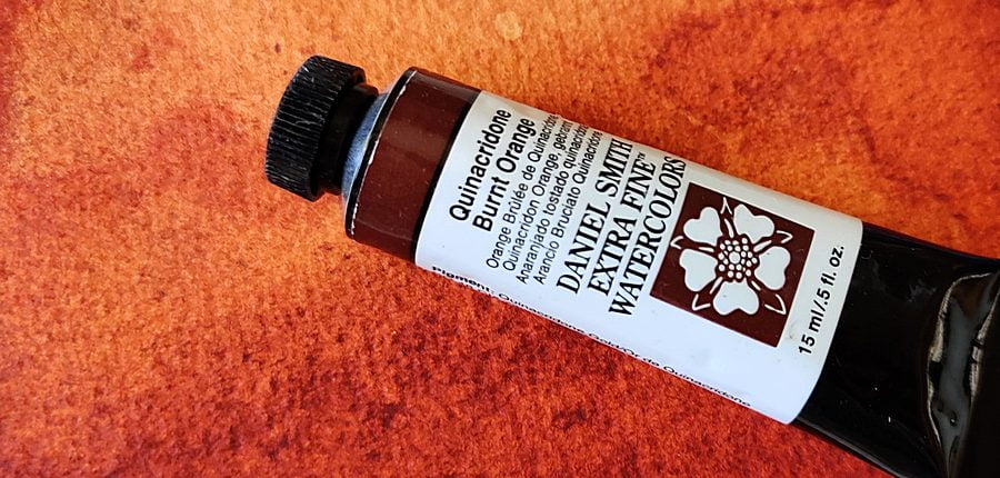
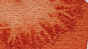
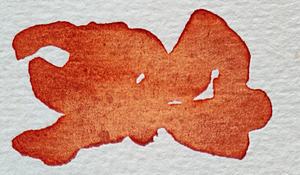
Quinacridone orange is a transparent, staining and very intense orange earth-colored pigment that first saw the light of day in 1958. A property, which it unfortunately shares with several other watercolor paints, is that it loses quite a lot of hue when it dries, although value is not affected as much .
The pigment is no longer being produced, but several manufacturers still have it in stock. Daniel Smith has enough for about 15 years of paint production, but if the color is important to you, you might want to buy it while it’s still available. The manufacturers of artist paints are dependent on the pigment industry for their pigments, their major customers are the plastics industry and manufacturers of car paints and the like, the manufacturers of artist paints are a trifle, so if a paint is not popular with the big users, production is discontinued. This has happened with Quinacridone gold and Nickel dioxin yellow, two of my previous favorites.
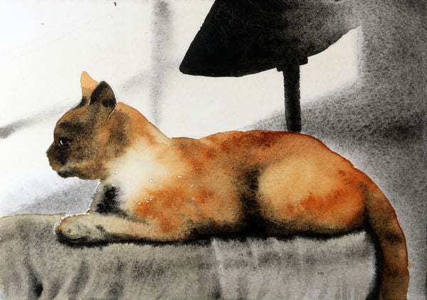
Quinacridone orange can be used as an orange-brown earth color, it is similar in several ways to burnt sienna from Winsor & Newton and Daler-Rowney, both of which use the pigment synthetic iron oxide. The color is not directly brown but more colorful, slightly unclear orange. It is a very beautiful color that I highly recommend.


The color mixes well with many different other colors, it is an asset in all palettes. Especially for those who like to mix themselves. Fantastic blurry greens and violet can be easily achieved but a shortcoming may be that there is no color that is an absolute complementary color, it is difficult to mix a gray color without using a third color in the mix.
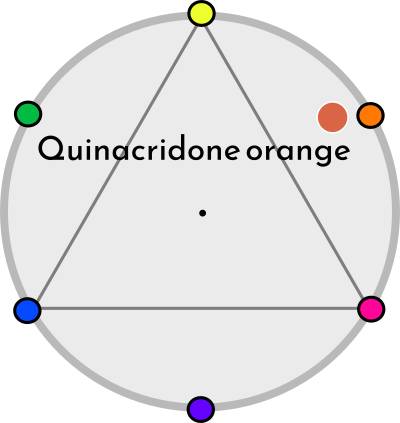
The pigment is quite common in different color mixtures but unusual on its own. Only a few manufacturers have Quinacridone orange.
QOR: Quinacridone gold deep
Daniel Smith: Quinacridone burnt orange
Roman Szmal: Quinacridone burnt sienna
M. Graham: Quinacridone rust
DaVinci: Quinacridone burnt orange
Properties
Color index name: PO48
Lightfastness: Very good
Transparency: Very transparent
Staining: Quite a lot
Granulation: Not at all


This is one of my favorite colors
Man kan blanda en grå nyans med hjälp av PB60, deft blue från schmincke. Tillsammans gör dom en bra svart också.
Bara ett klargörande: Färgen som schmincke kallar Deft blue är i själva verket Indantron. Jag gillar inte när tillverkare hittar på nya namn på färger med redan etablerade namn.