Perylene Red – PR149
March 23, 2024

As a pigment for artists’ paints, PR149 is relatively new, it entered the market in 1957, although the dye was invented about 50 years earlier. The pigment occurs as a component in a large number of mixed colors, but as an unmixed color, PR149 is not as common. Among the major manufacturers, I have found the following:
Maimeriblu – Crimson Lake PR149
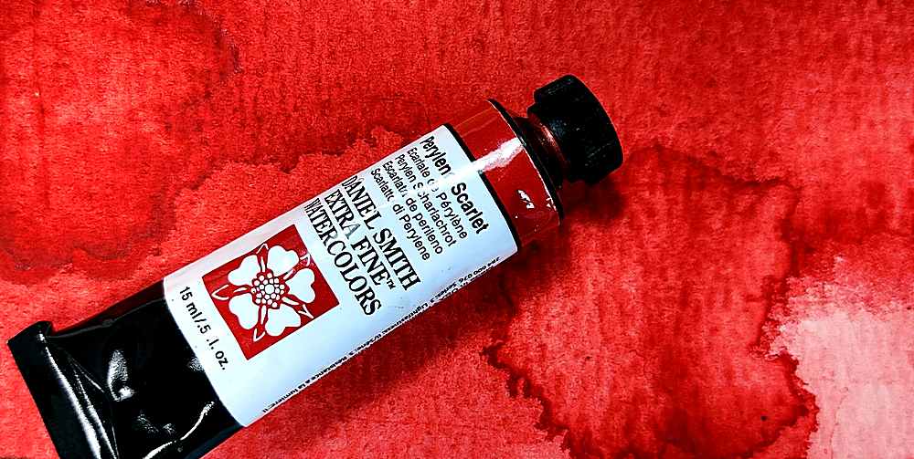
Daniel Smith – Perylene Scarlet PR149
Royal Talens Rembrandt – Perylene Red PR149
Roman Szmal – Perylene Scarlet PR149
Da Vinci – Perylene Red PR149
Michael Harding – Perylene Crimson PR149
There are a few more manufacturers, but they are less common and not as well known.
The color here named Perylene Red should not be confused with PR178, which is the color most often named Perylene Red. The two colors have some similarities, but PR178 is more in the orange direction, and is a bit cleaner in color. There are also manufacturers who call “Perylene Maroon” Perylene Red. So there is some confusion about naming Perylene colors that are red. To find the color this text is about, you should check the color index name which should be PR149, or use the list above to find the right one.
Naming the color seems to be troublesome for the manufacturers. PR149 can be called anything from Crimson Lake to Scarlet. But none of these names are a good description of the color. PR149 is a slightly dirty and deep mid-red color, and has nothing to do with red-orange scarlet or cold crimson.
Some manufacturers state that the paint granulates, but it is a very weak granulation, which is most evident in properly diluted liberally painted surfaces. Lightfastness is good but not excellent. The color is quite staining and not very willing to float with water.
It is semi-transparent, something that becomes apparent after it dries. As freshly painted, wet paint, it appears opaque, a property that turns to relative transparency once the paint dries.
Perylene Red loses only a little color when it dries. It becomes slightly less clear in the dried state, while the value is largely unchanged.

I don’t often use it unmixed, but mostly use it in mixtures together with green or blue paint. Together with different blue colors it gives beautiful black-violet mixtures, and with green color it creates brown-black shades that I like very much.


So if you need a mid-red intense color, with nice blending properties, this could be the color you’re looking for. However, you have to put up with a certain blackness and immobility in water.


Properties
Color index name: PR149
Lightfastness: Very Good
Transparency: Semi-transparent
Staining: Yes
Granulates: Weak


