Indanthrone (indanthrene) PB60
April 9, 2021

The dye PB60 was developed by the German chemical company BASF, and came onto the market in 1901, but it was not until the 1950s that it was used as a pigment in artists’ paints. The idea of the pigment was to imitate indigo. The name comes from indigo + anthraquinone which is the raw material from which the dye is a derivative. Sometimes the color is called indantren, which is actually the brand in which Indantron is included together with other dyes.
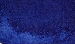
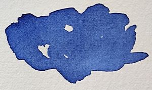
The color is warm blue-black, it is significantly bluer than genuine indigo. The pigment is very light-resistant and semi-opaque, it is strongly staining and very intense dark warm blue, almost violet. The complementary color to Indanthrone is yellow-orange, you can mix it with e.g. raw umber for a gray blend.

No. 2 mixed with Isoindoline Yellow which is a yellow-orange color becomes neutral
No. 3 Mixed with Nickel azo yellow which is warm yellow becomes greenish
No. 4 Mixed with raw umber becomes neutral.
You who like the color indigo (almost all indigo that can be bought today are mixed with other pigments) should try Indanthrone, it consists of a single pigment and it is intensely blue-black, much more beautiful than all ready-mixed colors.
Indantron is a color I use sometimes, when I do not need a clear blue for my painting, because its black content limits its use somewhat. But its intense warm blue hue is very attractive. A very nice color with some limitations.


Information
Color index name: PB60
Lightfastness: Very Good
Transparency: Only semi-transparent
Staining: Very
Granules: No


Beautiful mixes! I have this color and love it, but I can see I need to push it further! Thanks
Yes! It is an asset in every watercolor palette.