A green hell
October 10, 2024

A Swedish artist who primarily painted winter scenes is said to have once referred to summer and spring landscapes as “a green hell.” I don’t know who said this, or even if the story is true, but the description of a predominantly green landscape as “hell” is quite accurate.
Anyone who paints has likely tried painting a green landscape at some point. Most have probably also been disappointed with the results at some time. In this text, I will describe how I typically tackle the challenge of painting green landscapes. I will also mention the mistakes many beginners make when painting vegetation in a summer landscape.
Flat and Uninspiring
To achieve a meaningless, flat, and uninspiring green painting, do the following:
- Choose a pre-mixed color, like Sap Green or Hooker’s Green.
- Paint large areas with this green color.
- To make the color darker, just use more of the same green.
This approach is all too common. I see it often in beginners, and I understand why it’s so widespread. If the subject is green, it’s natural to choose a green color. The most common green paints are these uninspiring pre-mixed shades. And more of the same color makes it darker, right? The idea is sound, but the result is dull.
In reality, a tree’s foliage consists of various shades of green with different values. To mimic these greens, you need several shades ranging from light, possibly yellow-greens, to cooler (bluer) dark greens. You don’t need a dozen different green paints to create all these shades; you just need three colors.
Dynamic and Interesting
To create interesting and believable green landscapes, follow these steps:
- Choose a yellow and a blue and mix them to create two (or three) different greens.
- Paint all green areas by allowing the different greens to blend on the paper.
- To create a darker green, mix in red.


This is how I do it
First, I choose a blue and a yellow as the basis for my green mixes. For bright and spring-like greens, Phthalo Blue or Prussian Blue works well, as does the blackish Indanthrene Blue. For more subdued greens, I often opt for French Ultramarine or Cobalt Blue. I prefer to mix with Nickel Azo Yellow because it’s transparent and has good mixing properties, but almost any yellow works fine, including Yellow Ochre or Raw Sienna. Lemon Yellow gives the purest greens when mixed with blue.

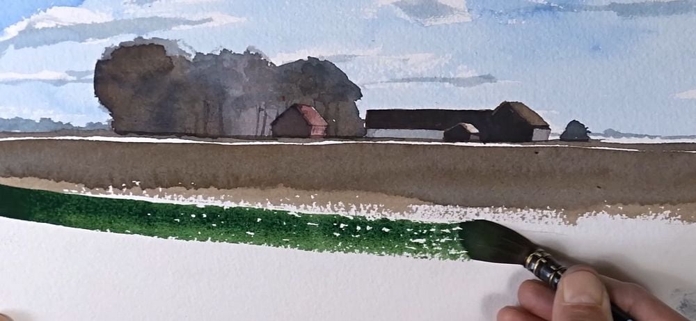
I start by mixing two different greens from the two colors: one light yellow-green that’s slightly yellower than the corresponding color in the subject, and a darker, bluer mix. I begin by applying the light green to the appropriate area in the subject and place the dark green next to it, allowing the colors to flow together on the paper. By letting the colors blend on the paper, you get a vast range of different shades. I also like to add some clean water here and there to create lighter greens. However, this requires that the two different greens have a significant difference in both hue and value, otherwise they will merge into a single shade. Mix the greens with a clear difference in both hue and value.

The darkest parts of a green landscape are likely almost black. To create such a color, blue and yellow aren’t enough; you also need the complementary color to green, which is a cool red. Common colors for this are Quinacridone Rose, Alizarin Crimson, or a brownish red like Perylene Maroon. Using a cool red, along with yellow and blue, you can mix a black color. This dark color can be made reddish, bluish, or any other shade, or simply black. You can vary the dark color depending on the result you’re aiming for. This very dark color is necessary for the darkest parts of, for example, a tree’s foliage.
I’ve described how you can paint with three different color mixes wet-on-wet, but there are many other ways to use the colors. You can, for example, apply them to the paper using glazing techniques, one layer at a time, or why not layer color spots that overlap each other?


However you choose to apply the colors to the paper, it’s a good idea to start with a blue and a yellow to create different greens, and to mix in a red to create the darkest tones in the painting.


Tack, som vanligt mycket informativt och lätt att at till sig,