
Paint what you see
May 15, 2026
 På Svenska
“Paint what you see, not what you know” is a fundamental principle in representational art. That does not mean it is the only way to approach painting. Pablo Picasso is said to have remarked: “I paint objects as I think them, not as I see them.” Art used as therapy, on the other hand, often follows the principle: “Do not paint what you see, paint what you feel.” But for the artist engaged in representational painting, the idea of allowing reality to dominate over one’s own preconceptions is crucial to success.
In the 1982 film The Draughtsman’s Contract, Mrs. Herbert marvels at the artist’s skill and asks:
– How is it you draw so well?
The draughtsman replies:
– I am not intelligent enough to do otherwise.
Mr Neville’s (The artist) point is that intelligence, interpretation, and preconceived ideas only interfere with the eye. If he were “intelligent,” he would begin to think about what he sees, what such an object is supposed to be, or why it is there — and that would corrupt his drawing.
Many people who are new to representational art are far too intelligent. Instead of depicting what they actually see, they try to understand what they are depicting, allowing their preconceived ideas about the object’s characteristics to influence the result.
Many years ago, I taught a course in which the assignment was to paint from a photograph showing a clearing in a dense forest. In the grass grew small spruce saplings. One student asked what they were, and I replied: spruce saplings. She then painted tiny stylized miniature fir trees, the kind one might see in a children’s book.
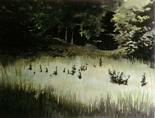
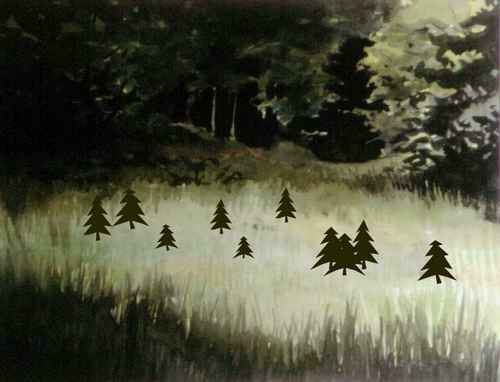

This was an extreme example of an artist painting what she believed she knew instead of what she actually saw. In this case, she replaced several small spruce branches with her mental image of what a spruce tree should look like.
A very common mistake is to paint the color one assumes an object has, without paying attention to how the object truly appears. Tree trunks are a good example. Beginners often paint them orange-brown — after all, everyone knows that trees are brown.
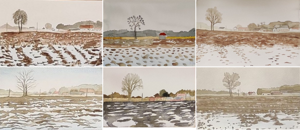
The same applies to the soil in a ploughed field. Both the field and the tree become brown in the paintings shown below. This happens because the artists imagine soil and tree trunks as brown, even though in the photograph they are black-violet and black respectively.
There are also other parts of the paintings that have been influenced by the artists’ perception of reality, such as what a tree looks like, or how big the houses in the background are and the contrast between light and dark parts of the subject.
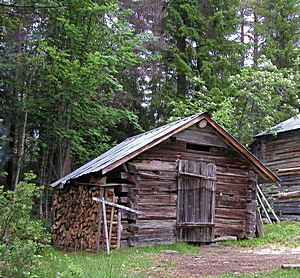
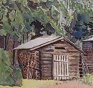
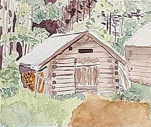
Perspective is another common pitfall. People often allow their assumptions about how perspective ought to work to control the image. In the example below, the old shed has a very pronounced perspective due to the low and narrow viewing angle. Yet many people’s preconceived notions of how such a perspective should appear often override reality.
A classic drawing exercise is to copy a photograph upside down. By turning the reference image upside down, the artist is forced to see angles and proportions without the brain interfering by telling the person what the object is supposed to be.
Many years ago, I watched an instructional video by an English artist — I believe it was David Curtis. In the background of an old barn he was painting, there was an object with vague, indeterminate shapes that could not be identified. He then said: “If it looks like a blob, paint a blob.
I have often used that quotation in my own courses: Do not let your intellect ruin your painting. Do not try to understand the object — simply paint what you see.


I’ve been reading this blog for quite some time now, several years, and I’ve learned a lot through this. Both about watercolour and about how I see things. I think it’s very generous of you to run it for me and other nerds 🙂
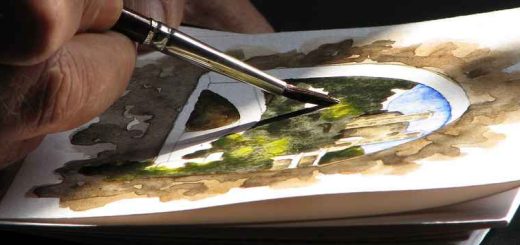
Right now I’m mostly experimenting with plein air, it’s good for me to try to translate a 3D world to a 2D image. I have a nice micro setup in my handbag, it consists of this:
a mints box with 6 half pans (1 yellow, 1 red, 2 blue, 1 black and potter’s pink) W&N
a Hahnemühle A5 250g cotton paper sketchbook
a flat Derwent waterbrush, the largest I could find
a water spraybottle
paper napkins.
As you can see I’ve taken a lot of your advice to heart. It’s hard to keep the half pans from drying out, though. I would like to create a slightly larger plein air kit, still in A5 size but with 5 ml tubes instead of pans, a real brush and a palette so I can do proper washes. I plan to use a 6/12 steel case with 6 empty full pans as a palette. It was the best I could think of, I don’t want to spill colour everywhere when I’m out and about.
Do you have any advice for me on a plein air setup about this size? It needs to be pretty lightweight.
I’m in Italy at the moment, but I’m teaching a course, so I haven’t had any time for painting myself. Tubes are a hassle when painting plein air. I find pans easier. It seems like a sensible set, although Potter’s Pink does make me raise an eyebrow. 😯
Me too. First I didn’t like it at all, but now it’s growing on me. I use it for weathered surfaces, like old wooden walls and old roofs, and to make granulating mixes with the other paints. None of the others in the box right now granulate. It’s new gamboge, winsor red, prussian blue and indanthrene. I know that new gamboge isn’t single pigment and that winsor red looks like a Ferrari, but I haven’t made friends with french ultramarine yet, the colour makes me sad for some reason. I’m experimenting with cobalt blue and deep cobalt blue, when I get the hang of a granulating blue I might change potter’s pink to something new I want to try out. Probably a green or an earth colour.
By the way, I did the lake Våmb exercise today, it was nice! Do you do this exercise on your courses sometimes? Do you use hairdryers then, or do you have some kind of drying cabinet?
Hope you’re having a great time in Italy!
Make friends with French ultramarine, it’s the best friend you can have. Yes, hair dryers are used quite a lot in the courses. Not in Italy though, here we have the opposite problem.
I’m working on my relationship with French ultramarine. I think maybe I just need to find the right brand. I’m looking for a deep, porcelain blue, heavily granulating, not to reddish colour. Right now I have Schmincke Horadam French Ultramarine. I’m planning to buy a tube of another brand. What do you recommend?