Red Favourites
May 14, 2025
Warm reds, in general, are tricky, in my opinion. Many of the ones that are beautiful on their own are difficult to mix with — and some that are good for mixing don’t look great on their own. The cool reds (rose) are easier; there are several that are good, and they work well in mixes. Below are the red colours I use the most. You could perhaps call them favourites, though even these have their flaws and shortcomings.
Quinacridone Rose

Quinacridone Rose is a cool red colour that is very clean, has excellent mixing properties, and is perfectly placed on the colour wheel. All of this makes Quinacridone Rose the ideal primary red. There are some challengers to the title of “best primary red,” such as Quinacridone Violet or Alizarin Crimson, but none are as versatile as Quinacridone Rose. As I see it, this colour is an absolute must in a watercolour palette intended for mixing.
Perylene Red

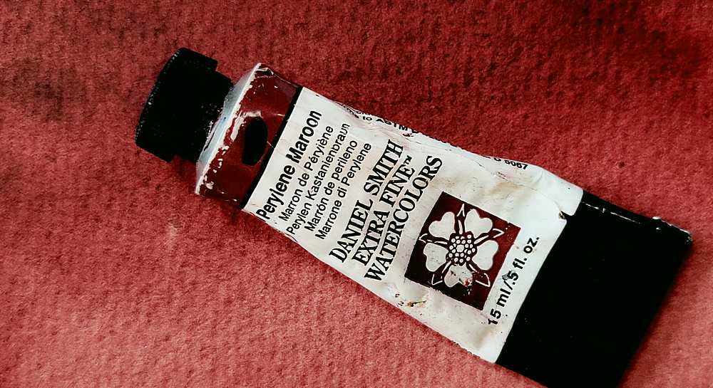
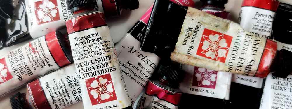
Perylene Red is a colour that mixes very well, but on its own it can appear a bit murky. It works well as a value darkener for both greens and blues. Its relative transparency is also appealing, especially for a fairly warm red. While it can be a bit uncooperative when used wet-on-wet, that is outweighed by how well it mixes. If you can accept that the colour is not fully lightfast and a bit unclear, it’s a very good warm red. A highly versatile watercolour, excellent for various blends.
Benzimidazolone Red

Is Benzimidazolone Red a red or a brown? I use it as a red, but it could just as well be treated like a reddish-brown, such as Perylene Maroon or Indian Red. It’s excellent for mixing, but perhaps not so great on its own — it’s so murky it might even be considered a brown. Still, its strong mixing properties make me happy to use it, despite the lack of purity.
Pyrrol Orange

The previously mentioned favourites lean a bit on the cooler side, but Pyrrol Orange is very warm — as the name suggests. Even though “orange” is part of the name, I use it as a warm red. The hue can vary quite a bit between manufacturers. Daniel Smith’s version used to be so red it wasn’t really orange at all, though now even theirs is more orange. Although it’s no longer as red, it’s still a very good colour that I use often.
I use more red pigments than those mentioned above, but these are the ones I reach for the most. It’s worth noting that there are no fire truck reds among my favourites — I simply don’t like them. They all have some property I find problematic: some are far too opaque, others mix poorly, some lack intensity — and honestly, I rarely have a need for a clear, intense, warm red.
When I do need a bright warm red, I usually go for Pyrrol Red or perhaps Quinacridone Red. Pyrrol Red is terrible in mixtures, and Quinacridone Red isn’t very strong and is rather boring — so it only happens occasionally.