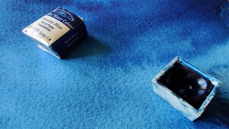
Prussian blue (Iron blue)

Iron blue or Prussian blue is a very old synthetic pigment, it was invented in 1704, by chance, by Heinrich Diesbach who was active in Berlin which was in then Prussia, therefore the color is often called Prussian blue or Berliner blue. Later, Diesbach moved to Paris where he started a major production of the pigment, hence the name Parisian blue as the paint is sometimes called, especially in oil paint. In printing, the name Milori blue is common.
Many other names also occur, especially as the dye manufacturers quickly discovered that Iron Blue was a dye that was very well suited for manipulation in various ways, e.g. through dilution, the pigment could appear as completely different colors, which also gave rise to a lot of other names. Antwerp blue is one such example, the dye iron blue and an addition of alumina (or barium sulphate, zinc oxide) create a paler variant, often with poorer durability.
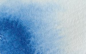
Iron blue is a dye with great variety, in its most concentrated form the color appears deep blackish, almost warm reddish, while well diluted the color is cold greenish, a condition that the experienced painter can benefit from. The color tone varies quite a bit depending on the manufacturer. The purity of the color also varies, from greyish blue to intense deep blue.
The color is not fully lightfast in full tone, as diluted it fades even faster. The variation is great between different manufacturers, some manufacturers have fairly durable iron blue while it fades faster in others.
Unfortunately, iron blue loses a lot of intensity when it dries, both in value and color, it becomes grayer when it is dry. The color blooms easily, if you like blooms the color is an asset, if you do not like blooms you may want to avoid iron blue which very easily causes these patterns.


From a blending point of view, iron blue is an uninteresting color. It is greenish and blackish, which complicates clear color mixtures. It is possible to mix different cloudy greens quite well, but for other color mixtures there are better alternatives. Iron blue has a spectrum that is a very gentle curve, without peaks. It is characteristic of a dull color with questionable potential for interesting color mixtures. Complementary color is a warm red, e.g. Venetian red. Most browns turn greenish along with iron blue.
Iron blue is often recommended for beginners because it is considered easy to use. Personally, I prefer to use phthalo blue, which is better from a blending point of view, but at the same time is difficult due to its intensity. Both of these colors have similar properties in other respects.


Information
Color index name: PB27
Lightfastness: Good to doubtful depending on the manufacturer
Transparency: Yes, very
Staining: Medium
Granulation: Just a little


