Cobalt Blue Deep (PB72 PB73 PB74)

In 1802, the French chemist Louis Jacques Thénard discovered the pigment we today call cobalt blue deep in an attempt to find a blue color that could replace the very expensive lapis lazuli. There are different ways to create this darker and redder variation of cobalt blue. Read more. What the different variants have in common is that deep cobalt blue is darker and warmer than regular cobalt blue. Although the color shares several other characteristics with cobalt blue.
Cobalt Blue Deep is a warm blue color that is quite opaque, but most manufacturers claim it is semi-transparent, some say it is opaque. It has a dark value but is not that intense. It is a very durable color. It loses a bit of hue and value as it dries, but not much.
Most manufacturers use PB74 or PB72, the third variant of deep cobalt blue, PB 73, occurs only as part of various color mixtures and not as a single pigment except in a few small manufacturers.
The colors from different manufacturers may differ slightly, both in terms of hue and granulation. However, all are redder and more intense than regular cobalt blue. When buying the color make sure it is indeed PB74 or PB72, both Schmincke and Da Vinci use a variant of regular cobalt blue.
Deep cobalt blue is an expensive color, as expensive as regular cobalt blue. However, since it is not as common and does not have the same status as cobalt blue, manufacturers do not falsify it. Namely, there are not that many who provide the color. I have only found six different ones, as well as two others that call a variation of regular cobalt blue for cobalt blue deep.
I sometimes use the color as a substitute for French ultramarine. When I’m looking for a slightly softer appearance than ultramarine can give. Because although the color is very similar to French ultramarine, it is not as intense and gives a calmer impression. Perfect for, for example, mild autumn colors together with burnt sienna. If I had to choose between the two it would still be French ultramarine, but cobalt blue deep is a very nice addition to my palette.

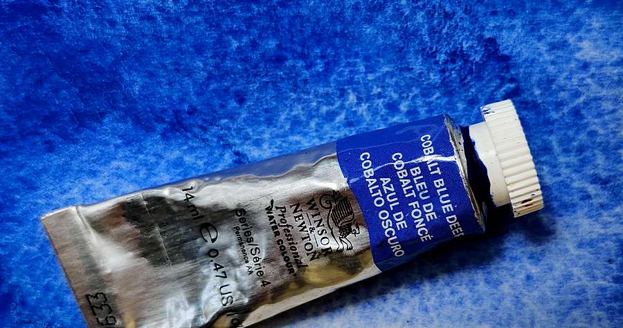
WINSOR & NEWTON: Cobalt Blue Deep (PB 74)
DALER ROWNEY: Cobalt Blue Deep (PB 72)
OLD HOLLAND: Cobalt Blue Deep (PB 74)
ROMAN SZMAL: Cobalt Blue Deep (PB 74)
MAIMERIBLU : Cobalt Blue Deep (PB 74)
KREMER Watercolor: Cobalt Blue dark (PB 74)
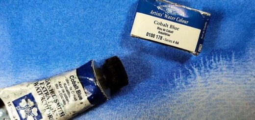
Regular Cobalt blue
SCHMINCKE HORADAM: Cobalt Blue Deep (PB74/PB28)
Da VINCI: Cobalt Blue Deep (PB28)


Color index name: PB72 PB73 PB74
Lightfastness: Excellent
Transparency: Semi-opaque to opaque
Staining: No
Granules: Yes, quite strongly


