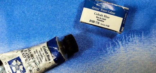
Is blue the most important color?

When I teach about colors for the first time with my students, I usually say that the color blue is important, perhaps the most important of all. On the other hand, I have met watercolor artists who do not even own a blue color, and say that blue color is unnecessary and even undesirable.
For me, blue sets the tone for a painting’s coloring. I mix it with others to create new colors and it therefore determines the tone of a painting. Together with yellow color you get various greens, with some red you mix violet colors. But the most important of all is probably that it forms the basis for black and gray color mixtures, usually mixed with some brown color.
You get a completely different color tone in a painting painted with French ultramarine compared to one done with phthalo or Prussian blue.
These two paintings of the same subject are painted with different blue colors together with burnt sienna, On the left is a painting done with French ultramarine and burnt sienna and the one on the right is painted with phthalo blue (RS) and burnt sienna. Big difference, right? The only difference is the blue color that sets its mark on the entire painting. For me, the choice of blue color is absolutely decisive for the feeling I want in a painting.


French ultramarine is reddish and intense and it granulates, suitable for winter and autumn motifs and paintings with a slightly rough character. Cobalt blue is quite a lot lighter and somewhat less red than ultramarine, with it you can also paint spring motifs, it gives a much milder color tone than ultramarine, it fits well with images with a lighter mood. Somewhere in between these two are cobalt blue deep.
Radically different blue colors are phthalo blue (both red and green shade) and Prussian blue. Both of these are intense cool blues, they dry up completely smooth (boring) and always give a slight greenish tint to the painting, sometimes so much so that mixtures have to be reined in with a dash of red to keep it from being too green. They are excellent colors for spring and summer paintings. The coloring becomes light and cheerful with these colors. They provide great opportunities for nice green color mixtures, they are less suitable for painting gray and gloomy with.

You will find the answer to the question at
the bottom of the page, in the comment field

Cerulean blue, cobalt turquoise and the now-disappeared manganese blue are examples of blue colors that are very light. They are all far too light to use as the only blue in a painting, they should be complemented with some deeper blue color.
It is fine to use two different blue colors in one and the same painting. Some artists believe that, so that they do not clash with each other coloristically, they should always be mixed with each other. But I believe that if you designate one of these (intense blue or pale blue) as the main blue in the painting, the second must always be mixed with the first, otherwise disharmony easily occurs.
An example: You paint a sea motif with French ultramarine but need a cooler blue color for the sky, you choose Cerulean blue for this. Then it is not a good idea to use them separately. A bit of French ultramarine in the sky ties the colors together. Or a splash of Cerulean blue in the sea along with ultramarine also works well. You should not paint the sea with unmixed ultramarine and the sky with unmixed Cerulean blue.
There are other blue colors besides those mentioned above, but they are less common and several are mixed colors. As any reader of this blog knows, I don’t like premixed colors.
So for me, the color blue is very important, almost all the different color mixtures that a painting is made of have a little blue in them. Green, violet, dark brown and black colors are all created with blue color mixed with one or two others. The color blue sets the mood and color in a painting. Sometimes it is possible to use two different blue colors, but then they should not be used individually unmixed, but they work better when mixed with each other.


The answer to the question of which blue color the house is painted with:
The left image is painted with phthalo, the right with ultramarine. Consider the color of the sky and you will see the difference. Also all the green which is much clearer in the painting painted with phthalo. You can also see a faint shade of green on the gray building on the left.
Thank you for this article! I think I’ve been waiting for it, for a while I wondered how you choose your colours.
Blue is the colour of feelings, I knew it!
Thank you for sharing your thoughts on blues. I never thought of them as setting the tone of a painting.