French Ultramarine

French ultramarine is a synthetic pigment, original ultramarine is extracted from semi-precious stone lazurite. Lapis lazuli is another name for the color. Good quality of Lapis lazuli could once be more expensive than gold (per ounce). The paint has been used at least since the 1000s in China, later in Europe. The use was economical (it is very expensive), the replacement paint was azurite which was more common and cheaper.
Of course, the need for a cheap alternative to this mineral paint was obvious. The Government’s Société d’Encouragement pour l’Industrie Nationale (A French organization whose aim is to promote French industry) announced a competition among European chemists to develop a blue pigment that can compete with Lapis lazuli. In 1828, the French chemist Jean-Baptiste Guime succeeded in this. The result is still used today and has been named “French ultramarine”

French Ultramarine is a deep warm blue (reddish) pigment, which has good Lightfastness, with a powerful and clean hue. It has excellent blending properties on the red side but rather poor on the green due to its red hue. A nice gray can be mixed with almost any brown color.


If I could only have one blue color, I would, without a doubt, choose French ultramarine. It’s actually one of the most important colors for me.
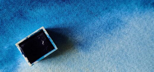
French ultramarine is not staining, but it does granulate quite a lot. It works well for paintings with character in the washes, but not so well for flat washes. It is doubtful to use for paintings with a lot of green, it does not mix so well with yellow, if you want dull murky greens, it is excellent. I always use it for motifs that are “ugly” such as old buildings, rough environments or quiet autumn landscapes. I think it fits less well in paintings with happy colors and color mixes.
The pigment is semi-expensive, usually in the upper half of the manufacturers’ price range. Therefore, it may be a good idea to check that you are actually using French ultramatrine, it happens that it is fake. A reliable manufacturer always states the color index name, which is PB29 for this pigment. If you use artist quality from a larger manufacturer, it is of course the correct pigment.
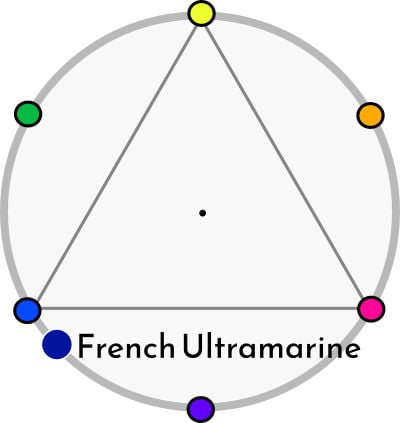
Properties
- An intense pigment
- It is semi-transparent
- Like most granulating pigments, the color is not staining
- Granules quite a lot
- Very good in mixtures to violet and gray, worse in the green direction.
- Semi-expensive color.
Information
Color index name: PB29
Lightfastness: Excellent
Transparency: Semi-transparent
Staining: No
Granules: Yes, quite strongly


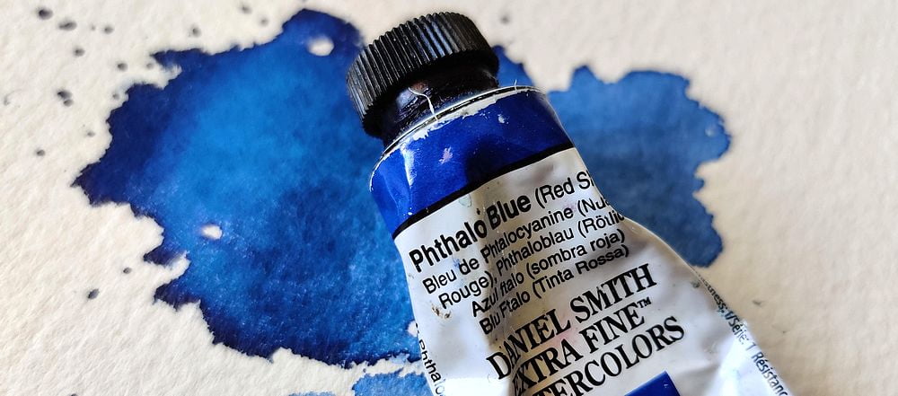
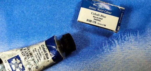


I use Daniel Smith, however, you use winsor and Newton. Is it better?
I do not like Daniel Smith’s burnt sienna at all. Flat, boring, reddish and pale. however, they have another one that they call “Italian burnt sienna” which is very nice. I like the orange hue of WS and the transparency, the intensity too, although it is synthetic.