Quinacridone Violet (PV42)

Quinacridone Violet is a lightfast, transparent, quite staining pink color that is very close to Quinacridone rose PV19 in hue. Like Quinacridone rose, the color is intensely colorful and loses tone as it dries. Both dyes were invented in 1958.
The main difference between Quinacridone Violet (PV42) and Quinacridone rose (PV19) is that it does not flow out as easily on a wet surface, it is a little less mobile wet on wet, and that it is a little less staining and a little less intense.


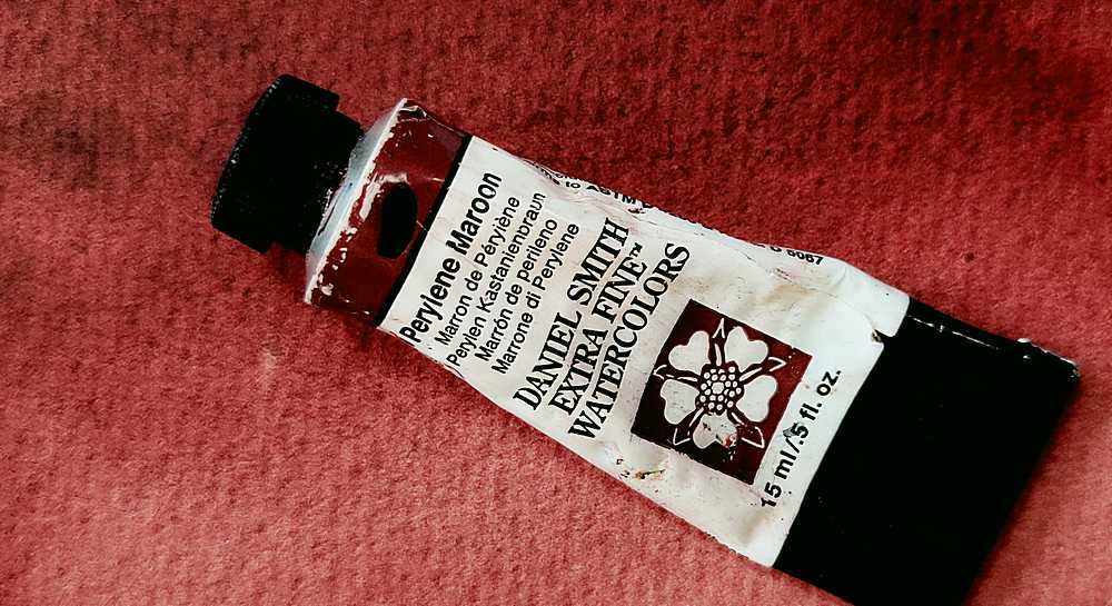
There are not many watercolor paint manufacturers that provide the paint, only Daniel Smith, Old Holland and Schmincke. Daniel Smith calls it Quinacridone pink and Schmincke gives it the name Magenta, Old Hollands has been given the name Royal Purple Lake.
Quinacridone Violet is so close to Quinacridone rose in hue that you can wonder if you really need both, and if you have to choose one of them, which one is better. If you like to paint wet on wet, Quinacridone rose is clearly better for this purpose. PV42 is a bit reluctant in wet on wet. But on the other hand, Quinacridone Violet (PV42) is not as staining, so if you like to wash off color afterwards, this color is better from that point of view.
Quinacridone rose is also a more powerful color, Quinacridone Violet is not as intense. Both colors lose hue and value as they dry. The color Quinacridone Violet has a tendency to flocculate slightly, an effect that you can see in the mixing sample below.
A mixture of Quinacridone rose and phthalo green YS gives a perfect black color as a result. They are exact complementary colors. Quinacridone Violet works for this purpose just as well. The result is just a little brighter because PV42 is not as intense as PV19.

Can you see the fine flocculation of pigment that Quinacridone Violet produces?

Slightly darker blend and no (or at least less) separation of pigments
You must have a primary red in your palette, which one you choose is a matter of taste, but if the choice is between these two, my choice would be Quinacridone rose. But if, on the other hand, you appreciate colors that stain less and leave a faint pattern on the paper, then choose Quinacridone Violet despite its slightly paler appearance. But don’t buy both, they are far too similar to justify having both in your palette.


- Primary red color
- Few manufacturers provide the color
- Very similar to quinacridone rose but slightly less intense and less staining
- Slightly flocculent pigment
Color index name: PV42
Lightfastness: Excellent
Transparency: Transparent
Staining: Quite staining
Granules: Very little


