Quinacridone red – PR209
May 2, 2021

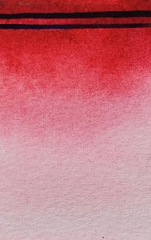
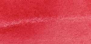
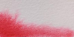
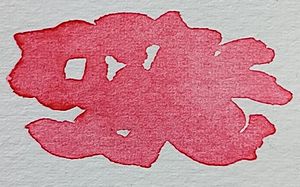
Quinacridone red is something as unusual as a transparent warm red color. The color has very good mixing properties and it is possible to successfully mix it towards both orange and violet. The paint loses only a little value and hue when it dries, which is an advantage. It is not quite as intense as many of its relatives in the large family of quinacridone pigments. The color is very staining and it does not granulate at all, it is completely lightfast.
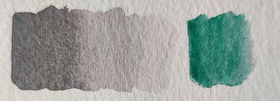
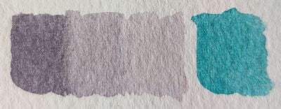
Quinacridone red is a color for those who want to mix. With it, it is possible to create beautiful color mixtures with virtually all other colors. A property that it is alone in among warm reds, both cadmium and pyrrole red can not be mixed in the violet direction. The complement color is a blue turquoise color such as. cobalt turquoise or cobalt green.
When the first quinacridone pigment arrived as watercolor, it was the pink color PV19, it was then named “kinakridonröd” in Swedish. Later came the pigment that this text is about, as far as I know this color does not have its own name in Swedish, the name “kinakridonröd” is taken by the pink variant, this usually causes problems for some of my students, I ask them to buy “kinakridonröd”, and then of course they buy quinacridone red. But it’s a different color.
Most manufacturers call the color quinacridone red but Daniel Smith calls it quinacridone coral, Daniel Smith also has a quinacridone red but it is the pigment PV19. The same goes for quinacridone red from St. Petersburg which is in fact the pink PV19. Check the color index name if you are unsure.
Quinacridone red is a very versatile color, Easy to mix with other colors, even in the violet direction despite its warm hue, it is also transparent and very light resistant. It is a color that is an asset in all watercolor palettes.


Information
Color index name: PR209
Lightfastness: Excellent
Transparency: Yes
Staining: Yes, very
Granules: No.
