
Mix with three primary colors

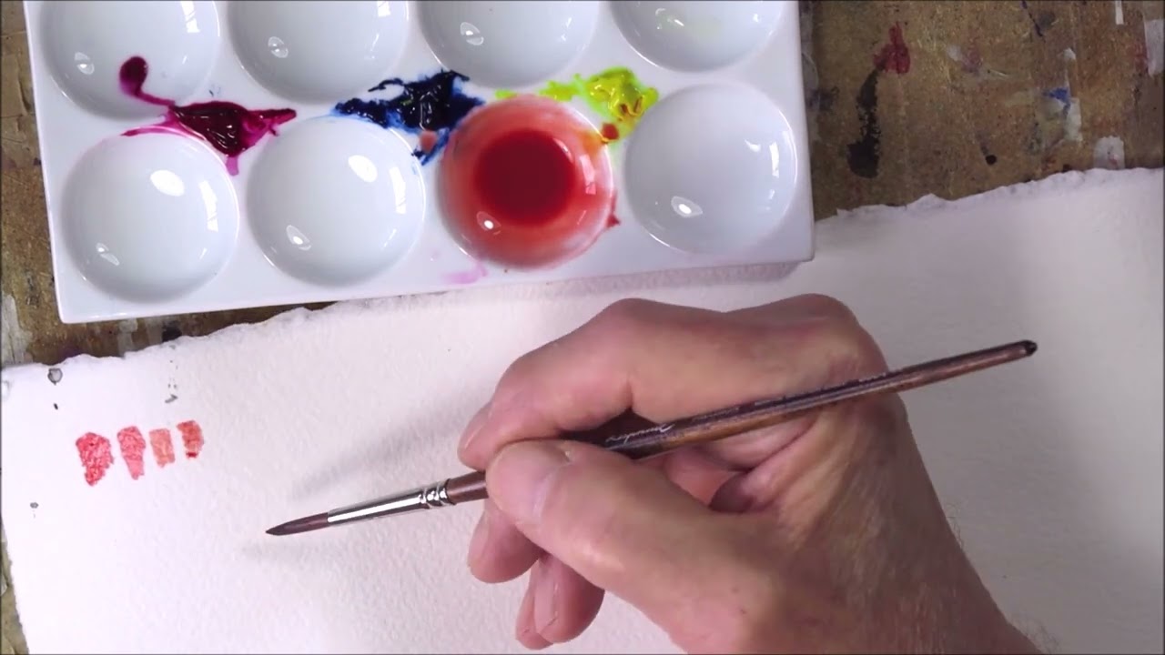
It is often said that with three primary colors, all other colors can be mixed. Therefore, we will test this with a few simple mixing exercises. To try these yourself, I recommend the following paints:
- Phthalo Blue, preferably the red shade, but the green shade will do. Prussian Blue can also work.
- Lemon Yellow, ideally PY175, but other cool yellows will work. Avoid opaque ones such as Cadmium Lemon (PY35), Nickel Titanate Yellow (PY53), or other opaque, milky, or dull yellows.
- Quinacridone Rose, sometimes called Permanent Rose by certain manufacturers. Other cool reds (pinks) will also work as long as they are clean and transparent. Avoid red colors that are blackish.
All color mixtures are done in steps: first a rough approximation of the desired color, then a more precise adjustment, and finally fine-tuning. Personally, I am often not too strict with color mixing. I think it’s more important that a mixture looks good in the painting I am making, rather than matching the real-life subject exactly.
When painting with only a few colors, almost all mixtures turn out harmonious, since they are created with just a handful of ingredients. Problems with incoherent color schemes usually arise when an artist uses too many different pigments in the same painting.
Brick
The first challenge is to mix a brick-red color. One way to approach a challenge like this is to start by imagining where brick color would fall on the color wheel. The color is a muted orange, so near the orange section of the wheel but a little “dirty,” leaning slightly toward the center where black lies.


The practical part of the exercise begins by mixing two colors to establish a base, and then refining it. So, mix yellow and red until you get a good shade of orange.
If you use a red with black content, such as Alizarin, the mixture might work with only yellow and red. If you use a cleaner pink color, the result will probably be too bright for brick. In that case, add a little of orange’s complementary color, i.e., blue. A common mistake here is using too much blue—especially Phthalo Blue, which is very intense. Add only a tiny bit at first. It’s easy to add more later, but if you add too much, you’ll need to make more orange with yellow and red.

Green Door
Now we will try mixing a muted yellow-green with the three primaries. This is a little harder than brick. The green is somewhat warm, leaning toward yellow, and rather dull. I estimate the color falls on the color wheel between secondary green and yellow, and more than halfway toward the center.


As almost always, you start by mixing two colors for a base tone—in this case yellow and blue, to get a yellow-green. Use slightly more yellow than blue. Once this tone is established, you need to mute it with green’s complementary color: red. As always when adding the third color, use just a tiny bit each time. If you add too much, you’ll have to adjust with both blue and yellow, which makes it more difficult.


Blue House


The blue-gray of the house is a tricky mixture. The color is almost neutral gray, with only a slight hint of blue-turquoise. I begin with blue, and then gradually add small amounts of yellow and red alternately until I reach a muted blue-turquoise mixture. Always add very little at each attempt—it’s easier to add more than to correct an over-saturated mixture. If you take too much of one color, you’ll have to compensate with both of the others, which is more difficult.


The method I’ve described here always works when a specific color mixture is desired. In short, it works like this:
- Think about where in the color wheel the color you’re trying to mix is located.
- First, mix two of the colors to make a rough approximation.
- Then take the third color and gradually add it until you have created an approximate mixture.
- Fine-tune the color mixture with minimal additions of the different colors until you achieve the perfect result.
In this text I’ve described some different mixtures using the three primary colors. But of course, the principle also applies to other colors. It works just as well with four different colors as with three, or even just two.
A very common mistake I often see beginners make is mixing all the colors too purely. This usually happens when the person neglects to add a complementary color. The third color is very important; you can almost never make a good mixture of, for example, a terracotta pot with only red and yellow — the blue color is essential for finding the right degree of dirtiness in the mixture.
Depending on which colors I have chosen for a particular painting, it’s not always possible to mix every shade. In such cases, I simply leave out that color. If I have chosen to make a painting with French ultramarine, burnt and raw sienna, and the subject includes something green, I do the best I can with those colors and settle for a gray-green. Since these three colors don’t allow for a true green mixture. That’s how I usually think about it. It is more important to stay consistent with the choice of colors than to achieve every single hue in the subject. That creates harmony in a painting.


