
Ultramarine (PB29)
July 31, 2026

 På Svenska
The original ultramarine pigment was made from the blue mineral lazurite, found in lapis lazuli, a semi-precious rock that has been mined in the mountains of northern Afghanistan for more than 6,000 years. The name ultramarine comes from the Latin ultramarinus, meaning “beyond the sea,” referring to the long sea routes by which the stone reached Europe.
During the Renaissance, natural ultramarine was more valuable than gold, which meant that artists used it very sparingly.
The demand for a more affordable alternative was therefore obvious. The French organization Société d’Encouragement pour l’Industrie Nationale, established to promote French industry, announced a competition challenging Europe’s chemists to develop a synthetic blue pigment that could rival lapis lazuli. In 1828, the French chemist Jean-Baptiste Guimet succeeded.
The new pigment had essentially the same chemical structure and optical properties as the blue mineral lazurite, but was often slightly more intense in color. It was produced by heating kaolin, sodium carbonate, and sulfur in a furnace. To distinguish it from the natural mineral, the new pigment was named French Ultramarine.
Today, the natural pigment is sold under names such as Lapis Lazuli or Genuine Ultramarine, while the name Ultramarine almost always refers to the synthetic version.

French Ultramarine is highly lightfast, chemically stable, and completely non-toxic. One drawback is that the pigment is sensitive to acids. A drop of vinegar or lemon juice can quickly bleach or even destroy the color. With a little imagination, however, this property can actually be used as an interesting artistic effect.
As a watercolor pigment, French Ultramarine produces a magnificent color—an intense, warm blue that is transparent and extremely durable. It has excellent mixing properties, is inexpensive, and is completely safe to use.
It works particularly well with red pigments, producing beautiful violet mixtures with cool reds. Combined with warm earth colors such as Burnt Sienna or Burnt Umber, it creates soft neutral grays, and with the right proportions the mixture can come remarkably close to black.

Greens mixed from French Ultramarine and yellow pigments are generally more or less muted. Cool yellows produce relatively clean greens, while warmer, orange-leaning yellows tend to create grayish or olive-green mixtures.
French Ultramarine is only moderately staining but granulates strongly. Both the degree of granulation and the way the paint adheres to the paper vary from one manufacturer to another. Slight differences in hue between brands are also common.
Today there are many variations of Ultramarine. Modern pigment technology makes it possible to alter the hue, particle size, and degree of granulation. These paints are usually sold without the word French and instead carry names such as Ultramarine Blue, Ultramarine Green Shade, Ultramarine Light, or Finest Ultramarine.
The most common of these is Ultramarine Blue. It is slightly less reddish than French Ultramarine, granulates less, and generally appears a little lighter. These differences are mainly the result of finer grinding and variations in the manufacturing process, although particle size is the most important factor.
All of these Ultramarine paints are based on the same pigment, PB29, but have been modified in different ways to produce warmer or cooler hues, more or less granulation, or a smoother appearance. Some versions are ground so finely that they feel almost velvety and exhibit very little granulation.
Some manufacturers also adjust the hue by adding small amounts of other pigments, most commonly Phthalo Blue. White pigment or Prussian Blue is sometimes used as well. I recommend avoiding these mixed Ultramarine paints.


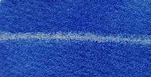

French Ultramarine is a true cornerstone of every watercolor painter’s palette. In my opinion, it is the single most important blue watercolor. It is a color I simply cannot do without. I appreciate its striking granulation and its deep, slightly violet hue, which allows almost every earth color to produce beautiful neutral grays when mixed with French Ultramarine.
Like most granulating pigments, French Ultramarine is somewhat reluctant to flow across wet paper. Apart from that, it possesses almost every quality one could wish for in a watercolor paint: it is lightfast, non-toxic, affordable, and has outstanding mixing properties.
Color index name: PB29.
Lightfastness: Excellent.
Transparency: Semi-transparent.
Staining: Not at all.
Granulates: Yes, quite heavily.
Color tone: Slightly reddish bright blue. There are both warmer and cooler variants.


I use Daniel Smith, however, you use winsor and Newton. Is it better?
Both are very good, W&N granulates a little more.